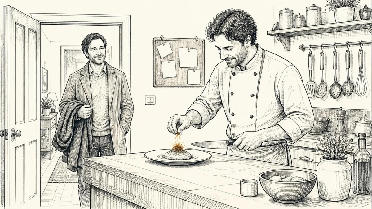
If I answer my front door holding a knife, you're going to be concerned. Nobody expects that. But walk into my house and find me in the kitchen holding the same knife, and you think, "Oh, good. We're about to eat."
Same knife. Same person. The place changes what it means.
Products work the same way. People are very good at recognizing patterns, and they notice fast when something breaks one. Sometimes breaking the pattern is exactly what sets you apart. Sometimes it's a knife at the front door. The hard part is knowing which is which before you ship.
I use a simple split for that: sixty, twenty, twenty. I've used it in two very different places, a checkout at Meta and a design system at Personify.
Many checkouts, one checkout
At Meta, I worked on pulling together the checkouts from many different parts of the company into one approach under Meta FinTech. That checkout had to serve Facebook Marketplace, Novi (the blockchain start-up), NFT sales, Instagram, Meta Pay, WhatsApp Payments and Ads, some of which already had checkouts of their own.
Every one of them wanted something different. For Ads, the goal is selling ads: get people through, make paying easy, make it recurring. For Marketplace, the real goal was first-party data: building and connecting things so the information is useful to the company, even before anyone pays, as people narrow down what they're looking at. For WhatsApp, it had to be simple, and connect to what was already shared in the thread or relevant to the person accepting the payment.
And no area had to adopt what came from the mothership. Nobody was forced to take it. So the only way it worked was to build something that was actually better for each of them. Instagram never wants its checkout to look like WhatsApp's, or like Ads'. It wants to look different, and it has slightly specific needs.
The sixty
Sixty percent should be the same underneath. This is what checkout looks like. You don't redesign it for every product, and you shouldn't want to.
One thing we saw: when you deviate from an existing checkout pattern, people pause, and that pause will cost you money. The sixty is the knife in the kitchen, exactly where people expect it. Move it and they stop to wonder why.
I'd used the same split years earlier, building a design system at Personify. Personify sold a core application to large nonprofits, and customers usually paid for customizations to fit their back office, their membership, their programs or their certifications. The sixty there was everything that shouldn't be figured out in the moment. It comes from existing patterns, yours and the industry's. Don't think about it, just do it. Taking a credit card is a sixty item. Nobody needs a creative take on it.
A design system gives you that sixty out of the box. At Personify, the design system cut development cost and time by 30%. It showed up in two places: building the next version of the core product, and in customizations, which got faster and cheaper for customers. A solution for handling and communicating a certification could move to another customer instead of being built from scratch.
The first twenty: whose house it is
The next twenty percent belongs to whoever is serving the experience.
At Meta, that was the product: WhatsApp, Instagram, or Horizon in the metaverse on Oculus, which was very different from all the others. At Personify, it was the organization: the patterns that come from how you operate, what you believe, your standards, the things you do across all your products.
This is the twenty that makes Instagram feel like Instagram. If the platform team doesn't leave room for it, every product team will fight the platform, and since no one has to adopt it, they'll just leave.
The last twenty: the moment
The final twenty percent is the use case. What's being transacted, and when.
Selling an NFT is different from taking payment on a rickshaw, which is different from selling a t-shirt in Brazil over WhatsApp. The question I'd ask is: what is someone getting for the consideration they're giving?
At Personify, this was the twenty where you differentiate and make the experience amazing. It's specific to that use case and that moment, and it doesn't feed back into the design system. That's fine. One of the wonderful things a design system (or a design library, or a brand library) does is let you spend your attention on what's going to differentiate your work.
You have to think about all three at once. The shared sixty. Room for the product's twenty to grow. And the twenty that's about the when and the what.
Why the split matters
Most platform fights are really arguments about which twenty something belongs in. The product team says "this is our brand." The platform team says "this is checkout, it should be the same everywhere." Both can be right. The split gives them a way to have the argument without it turning into a turf war.
It also tells you where to spend. The sixty is where you save: build it once, make it excellent, and let everyone stop thinking about it. The twenties are where the money and the craft should go, because that's what customers remember.
Get the proportions wrong in either direction and you pay. Too much sameness and every product feels like a copy of the one next door. Too much difference and people pause. And that pause costs money. ("One platform out of five acquisitions" and "Let them change how they pay" come at the same problem from the platform and billing sides.)
Where the metaphor breaks
In a house, everyone can see which room they're in. In a product, your team knows the context, but the customer arrives from somewhere else, an ad, a chat, a link from a friend, and brings their own idea of which room this is. They decide what counts as the kitchen. Watch people use it before you assume you know.
The numbers aren't precise, either. Nobody measures an experience and finds exactly 60%. Treat the split as a way to decide where your attention goes. If a team says everything they do is in the last twenty, they're probably redesigning the credit card form.
Try this
- Pick one flow your customers use in more than one product: sign-in, checkout, onboarding, settings.
- List every step. Mark each one sixty, twenty (product or organization) or twenty (moment).
- For every sixty step that differs between products, ask who decided that, and why. Most of the time, nobody did.
- For every twenty step, write one sentence on what it gives the customer that the shared version couldn't.
- Watch five people go through the flow. Note every pause. Then check whether each pause landed on a step you meant to be different.
Where do you land?